> ## Documentation Index
> Fetch the complete documentation index at: https://docs.unoverse.ai/llms.txt
> Use this file to discover all available pages before exploring further.
# The design system
Build on a stocked design system from day one: components, templates, atoms and the token
foundation, installed from the marketplace and ready in **studio**.
It is a living library. We develop it continuously, new pieces arrive with updates, and
your universe holds it read-only, so it is always there and never yours to maintain.
 ## What ships
| Kind | What you get |
| -------------- | ----------------------------------------------------------------------------------------------------------------------------- |
| **Components** | Ready pieces an Agent can send: `card`, `table`, `bar-chart`, `metric-grid`, `streaming-text`, `voice-chat` and more |
| **Templates** | Default arrangements: `grid-page` for browse-and-detail, `email-digest` for a composed letter |
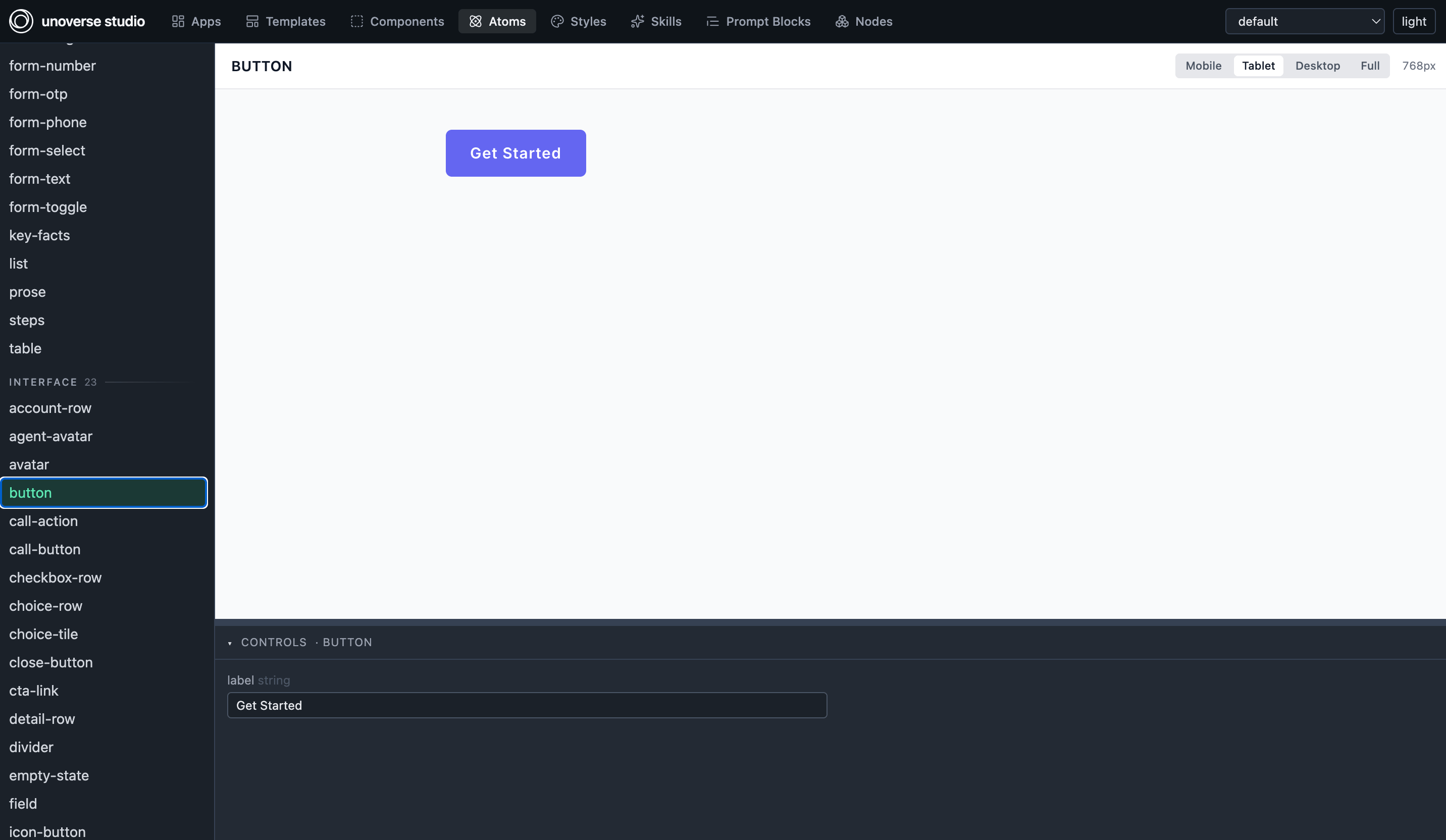
| **Atoms** | The leaf vocabulary components are made of: `button`, `avatar`, `callout`, `faq`, `detail-row`, `empty-state` and dozens more |
| **Styles** | The token foundation every definition resolves against, in base, semantic and theme layers |
Atoms are the layer we manage most actively. They are the shared shapes end components
compose from, so improving one improves every component built on it, yours included.
## How to use it
Everything resolves by its bare name, from anywhere in your org:
* **Place a component or template as it is.** A workflow can deliver `card`; an app can
mount `grid-page`. No copy, no import.
* **Compose atoms into your own components with `Ref`.** The atom carries the shape; your
`Ref` binds the data and may override single style keys without forking it.
* **Skin it with your tokens.** Every visual value in the library is a token name, so the
whole system arrives wearing your brand, and a rebrand touches none of it.
Two rules keep the tiers clean, and the lint enforces both: your own artifacts never take
a name the design system uses, and the design system never references anything of yours.
## Read it as sample code
Every piece is a working exemplar of the platform's own conventions, and the code is one
click away. Open **studio**, pick anything in the Components list, and the definition sits
beside its live preview. When you are unsure how to shape something, find the nearest
design-system piece and read how it is built.
## What ships
| Kind | What you get |
| -------------- | ----------------------------------------------------------------------------------------------------------------------------- |
| **Components** | Ready pieces an Agent can send: `card`, `table`, `bar-chart`, `metric-grid`, `streaming-text`, `voice-chat` and more |
| **Templates** | Default arrangements: `grid-page` for browse-and-detail, `email-digest` for a composed letter |
| **Atoms** | The leaf vocabulary components are made of: `button`, `avatar`, `callout`, `faq`, `detail-row`, `empty-state` and dozens more |
| **Styles** | The token foundation every definition resolves against, in base, semantic and theme layers |
Atoms are the layer we manage most actively. They are the shared shapes end components
compose from, so improving one improves every component built on it, yours included.
## How to use it
Everything resolves by its bare name, from anywhere in your org:
* **Place a component or template as it is.** A workflow can deliver `card`; an app can
mount `grid-page`. No copy, no import.
* **Compose atoms into your own components with `Ref`.** The atom carries the shape; your
`Ref` binds the data and may override single style keys without forking it.
* **Skin it with your tokens.** Every visual value in the library is a token name, so the
whole system arrives wearing your brand, and a rebrand touches none of it.
Two rules keep the tiers clean, and the lint enforces both: your own artifacts never take
a name the design system uses, and the design system never references anything of yours.
## Read it as sample code
Every piece is a working exemplar of the platform's own conventions, and the code is one
click away. Open **studio**, pick anything in the Components list, and the definition sits
beside its live preview. When you are unsure how to shape something, find the nearest
design-system piece and read how it is built.
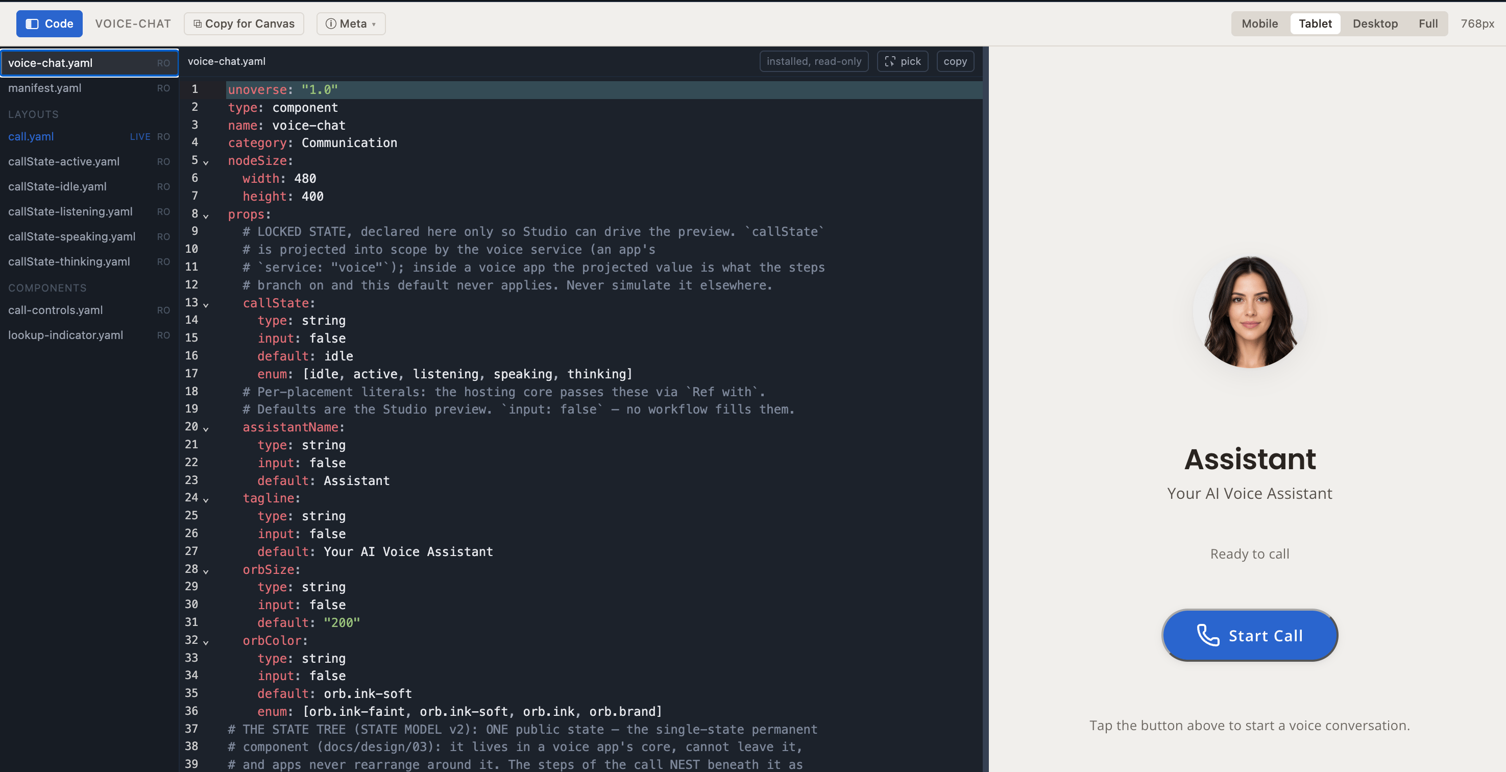 The same files are public on
[GitHub](https://github.com/unoverse-platform/marketplace/tree/main/definitions), plain
YAML, no running platform needed.
## Keeping it current
The design system installs and updates through the **marketplace** in your universe's
Studio: **Install** the first time, **Update** when a newer version waits. An update is a
data change, so it is live everywhere the moment it lands, with no release of yours.
## Next steps
Build your first component beside the library.
The grammar every artifact shares, the library's included.
The same files are public on
[GitHub](https://github.com/unoverse-platform/marketplace/tree/main/definitions), plain
YAML, no running platform needed.
## Keeping it current
The design system installs and updates through the **marketplace** in your universe's
Studio: **Install** the first time, **Update** when a newer version waits. An update is a
data change, so it is live everywhere the moment it lands, with no release of yours.
## Next steps
Build your first component beside the library.
The grammar every artifact shares, the library's included.