

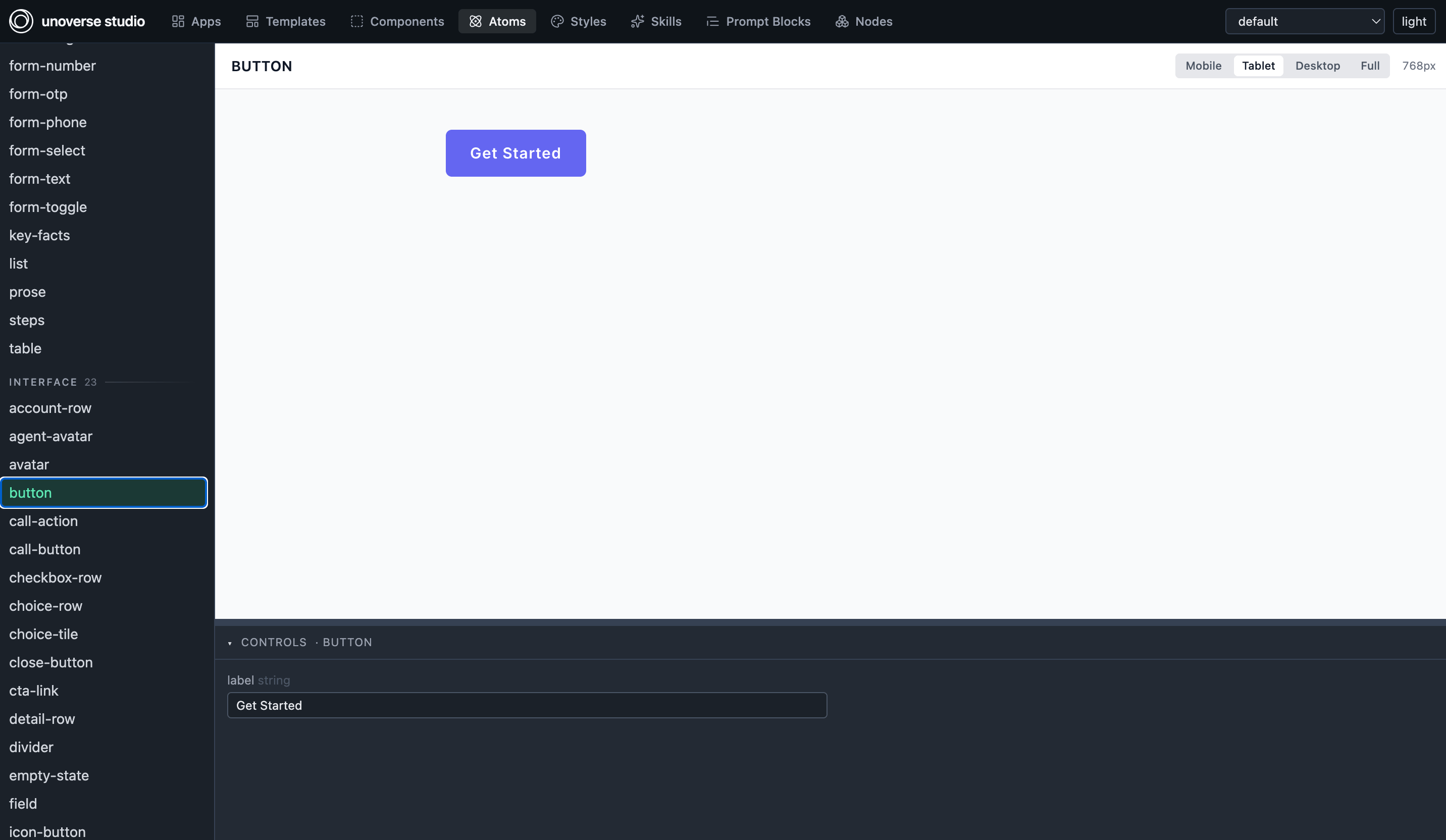
The library in studio: the button atom previewing live, its controls beneath.
What ships
Atoms are the layer we manage most actively. They are the shared shapes end components
compose from, so improving one improves every component built on it, yours included.
How to use it
Everything resolves by its bare name, from anywhere in your org:- Place a component or template as it is. A workflow can deliver
card; an app can mountgrid-page. No copy, no import. - Compose atoms into your own components with
Ref. The atom carries the shape; yourRefbinds the data and may override single style keys without forking it. - Skin it with your tokens. Every visual value in the library is a token name, so the whole system arrives wearing your brand, and a rebrand touches none of it.
Read it as sample code
Every piece is a working exemplar of the platform’s own conventions, and the code is one click away. Open studio, pick anything in the Components list, and the definition sits beside its live preview. When you are unsure how to shape something, find the nearest design-system piece and read how it is built.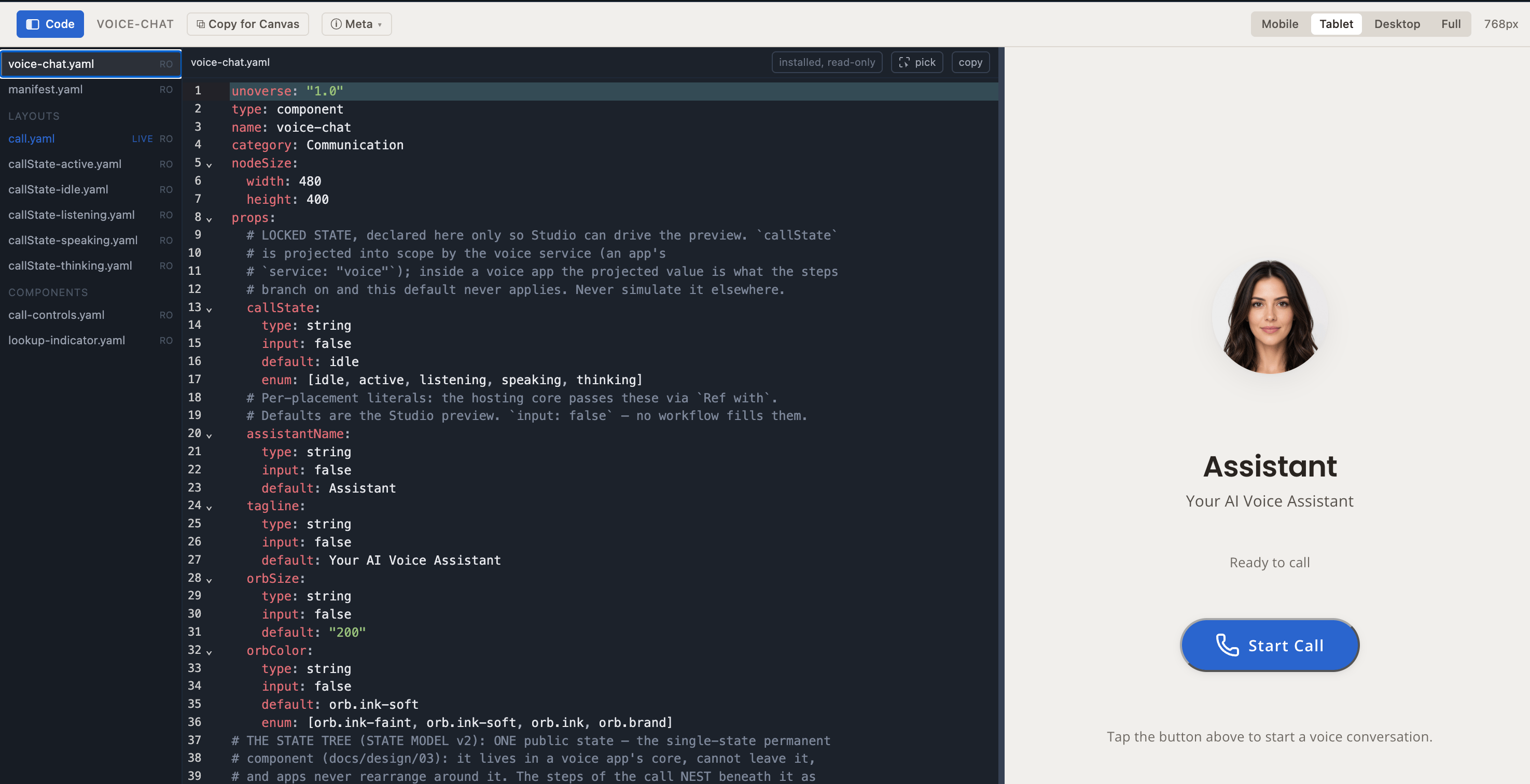
The voice-chat component in studio's code view: the full definition, read-only, beside its live preview.
Keeping it current
The design system installs and updates through the marketplace in your universe’s Studio: Install the first time, Update when a newer version waits. An update is a data change, so it is live everywhere the moment it lands, with no release of yours.Next steps
Quick start
Build your first component beside the library.
Essentials
The grammar every artifact shares, the library’s included.