

design/ in the
current folder, any parent, or a single folder directly below, so it works from inside your
project or from the folder you created it in. Studio covers the
install.
What you get
A definitions rail on the left, a native preview on the right, and DevTools beneath it.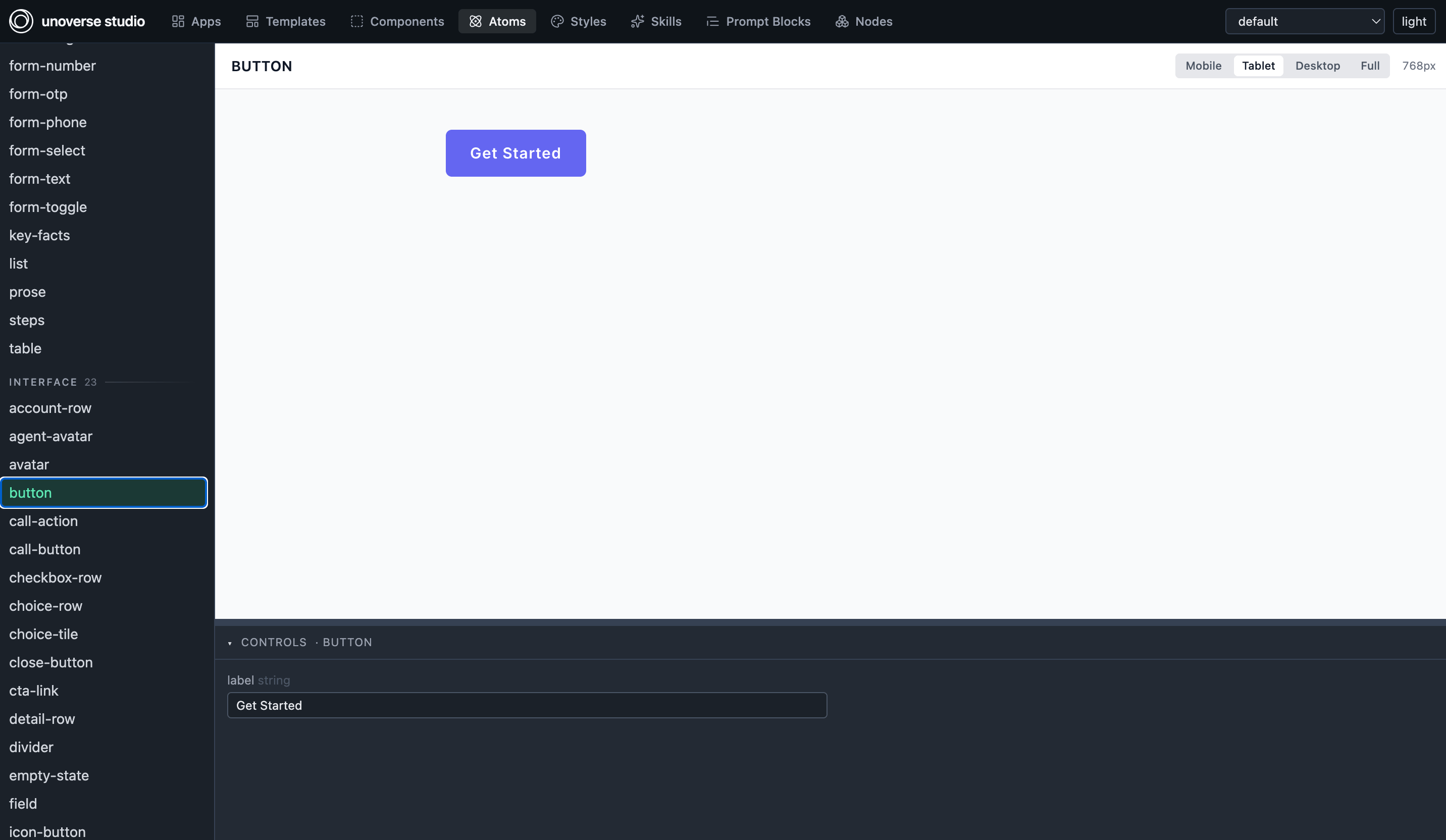
An atom selected: the rail on the left, the live preview, and its controls beneath.
A header switcher scopes the whole of studio: the lists and the preview theme. The
Components list shows the design system plus your own components, and All shows every
project at once with a badge per card.
Atoms preview but never serve, because the server expands every
Ref before anything
leaves it, so no channel ever receives an atom.
studio is another MCP client, running the same SDK, the same definition resources and
the same component stream as production. Hot reload is not a development trick, it is the
resource subscription that live-updates production channels too, and a definition that
works here works in production because there is no second path for it to work differently
on (How it works).
Mock mode
Render anything with mock data and mock history, and no backend involved. This is your daily loop while designing, and it needs no fixtures at all, because two things you have already authored supply everything. Prop defaults are the mock data. Every definition renders from its own declared defaults, which is why defaults should be realistic content rather than empty strings. The state switcher is the state tree. Each public state appears as a pill, in tree order, and a flat definition with no tree shows none.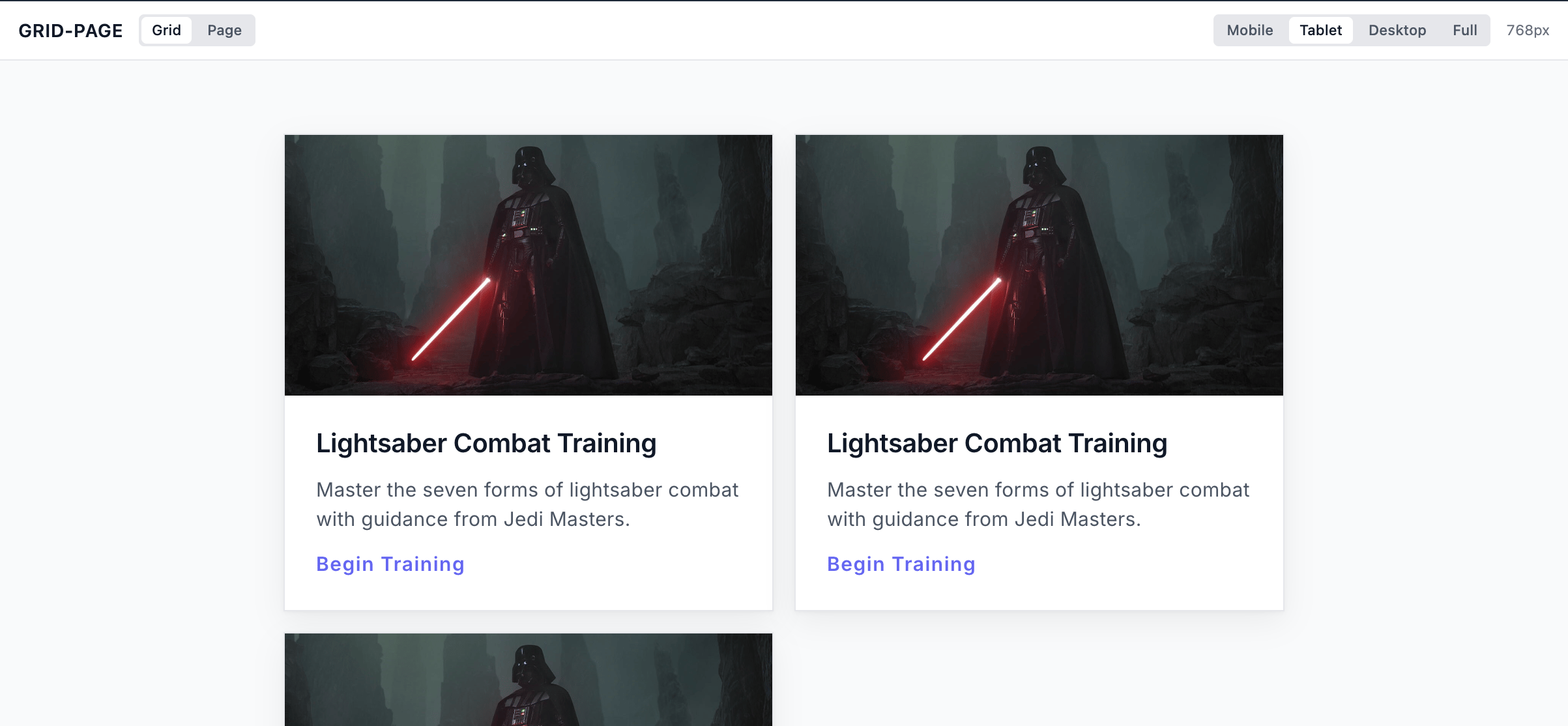
Each public state as a pill, taken straight from the declared tree.
state into the slice, and picking a step writes that state’s own
axis. Both go through the same setValue a real button uses, so acting inside the preview
transitions exactly as the runtime does.
The viewer renders the served tree and never scans layouts. There is no visibleWhen
archaeology and no Switch-scanning, because the declaration is the enumeration. Use the
switcher to exercise every discriminant value, every public state, every wizard step and
every callState phase, and vary the prop defaults to check edge data such as empty lists
and long text. That is how you catch a bind with no default.
Live mode
Flip the toggle and studio connects as an MCP client to your real running platform. Real workflows stream real components, select real apps and deliver real data into the local preview, so you are watching production behaviour before shipping. Live mode proves the things mock cannot:- Your component’s node receives and merges streamed data correctly.
- App selection picks your app for the intents you wrote
whenToUsefor. - The reaction runs end to end: an interface arrives in a public state, the app enters the matching state, its slot frames the interface, and the ✕ releases it back to the base.
- Turn lifecycle behaves, so thinking indicators derived from
isStreamingappear and, critically, clear.
DevTools
Debug in one order, always: the stream log to see whether it arrived, the state inspector
to see whether it landed in the bucket you read, then the definition to check your bind.
Never start by editing the definition on a guess.
Copy for Canvas
Select a component and studio shows a Copy for Canvas button. It copies the component as a canvas node to your clipboard, andCmd+V on any workflow canvas pastes it
in, sized to the component’s nodeSize.
That is how a design component reaches a workflow. The node library does not list
components, so you preview one here, copy it, and paste it where the workflow needs it. No
file edit and no restart, because you are only placing a node.
The full loop
Edit the definition, watch it in mock, prove it in live, then publish.Next steps
Validate and ship
What the lint enforces, and what only you can judge.
Troubleshooting
Symptom, cause and fix for the mistakes that recur.