

styles/, as the values every definition resolves against. A
definition never holds a colour, a size or a typeface. It names a token, and the theme
decides what that name means.
The SDK owns no styles either. It resolves token names against the theme your platform
serves live, at unoverse://theme/<name>, so a colour change is a refresh rather than a
release.
The law
A definition owns zero style values. Token names only.- No
px,rem,emor#hexin any component, atom, template or app. The deploy lint scans for exactly this and blocks (Validate and ship). - Sizes use the space scale. Step N is N × 0.25rem, so
width: "8"is 2rem. Only real steps exist, and an invented one such as"26"is not rounded: it falls through as broken CSS and the element silently reverts to auto sizing. Scales lists every step. - Never invent a component-named token such as
cardMinorwizardWidth. If the scale genuinely lacks a step, extend the scale instyles/rather than smuggling a value into a definition.
semantic/layout.yaml: compact, narrow, reading,
page and wide. They are aliases onto the same scale, so a cap reads as what it is.
Use a name for a page-level cap on maxWidth, hideBelow or stackBelow, and a scale
step for an element’s own size. An image tile is not a page.
Brand and dark-mode swaps must touch styles/ alone, and one raw hex in one definition
breaks that guarantee for the whole project.
Style keys
The set of style keys is closed too.padding, direction, radius, hover and the
rest are the neutral intents the SDK interprets, and the contract every renderer
implements: web today, and iOS, Android and Flutter as those SDKs land.
An unknown key is ignored by every renderer, so it is always a typo such as colour, or a
web-ism that would never port, such as backdropFilter or gridTemplateColumns. The
schema squiggles it as you type and the deploy lint errors on it, including inside hover,
active and when[].apply.
A design that genuinely needs an intent the vocabulary lacks is a platform conversation,
because every renderer has to implement it. It is never a definition-side workaround.
Layout
Equal splits need nothing but a column count. Two children in a two-column grid are halves, and four in a four-column grid are quarters.span is for unequal splits. Put a twelve-column grid on the container and let each
child say how many columns it covers, so 6 is a half, 4 a third and 3 a quarter:
width: 50% twice plus a gap always
does.
Stacking is automatic. A spanning child gives up its span and takes the whole row once
the grid runs out of space, so four quarter-width cards become four full-width cards,
stacked. The threshold is grid.stackBelow in semantic/grid.yaml, and one grid can
override it inline with stackBelow.
It measures the grid, not the browser window. A component reacts to the space it was
actually given, so the same component stacks correctly in a narrow rail and lays out wide
in a full panel, on any device. That is the same mechanism as hideBelow and hideAbove,
and it is why there are no device breakpoints anywhere in design/.
Atoms
A token stops a value being repeated. An atom stops a combination of them being repeated. If several components draw the same card, the card’s style is written once and composed withRef:
Ref’s own style merges over the atom’s, so a definition keeps the shared look
and still overrides one thing, a tighter padding or no border, without forking the atom.
The atom is the look, and the Ref is this instance’s exceptions. Reach for a new atom
the moment a second component needs the same combination, and never copy the block.
A Ref also composes a whole flat component, which is how a shared piece of interface
travels rather than a shared look. What it inlines reads the host’s data, because an
embedded piece has no slice of its own, so the piece’s starting values come with it. The
host’s own values win on any key it declares, and the piece’s public state never travels,
because arriving somewhere is the host’s decision.
The token layers
base raw scales: the only place raw values exist
color.yaml palettes
spacing.yaml the space scale
typography.yaml font scales
radius.yaml and shadow, border, motion
semantic named meanings, built from base
text-styles.yaml headline.lg, body.sm, named by role
layout.yaml page widths by name
grid.yaml when a columns grid stacks
app-sizes.yaml chat, rail, panel
prose.yaml and fonts, icons, skeleton, keyframes, root
themes brand and dark-mode swaps
light.yaml
dark.yaml
Definitions speak semantic. Themes remap semantic onto base per brand or mode, and a
theme-contract guard keeps the names consistent, so every theme satisfies every definition.
Each project gets its own complete copy of this set, which is why two projects can take
different looks from the same design-system component without either one forking it.
unoverse create scaffolds the set, so rebranding is editing values rather than inventing
structure.
Standard app sizes
semantic/app-sizes.yaml holds the named widths an app’s appWidth references
(Apps). The starter set:
Every size carries a viewport ceiling, so it is the full designed width on desktop and
never wider than the screen on a phone. Names are optional, since raw CSS in
appWidth is
valid, but a name keeps every app in the project on one scale and makes retuning a single
edit. These values are raw host-facing CSS on purpose: they size the app’s outer panel,
which the embedding page applies, and they are never inner styles.
Typography
All type edits happen in your project’sstyles/. See the whole system live in
studio’s Styles screen: every role as a specimen, with your overrides marked and
everything else inherited from the design-system foundation.
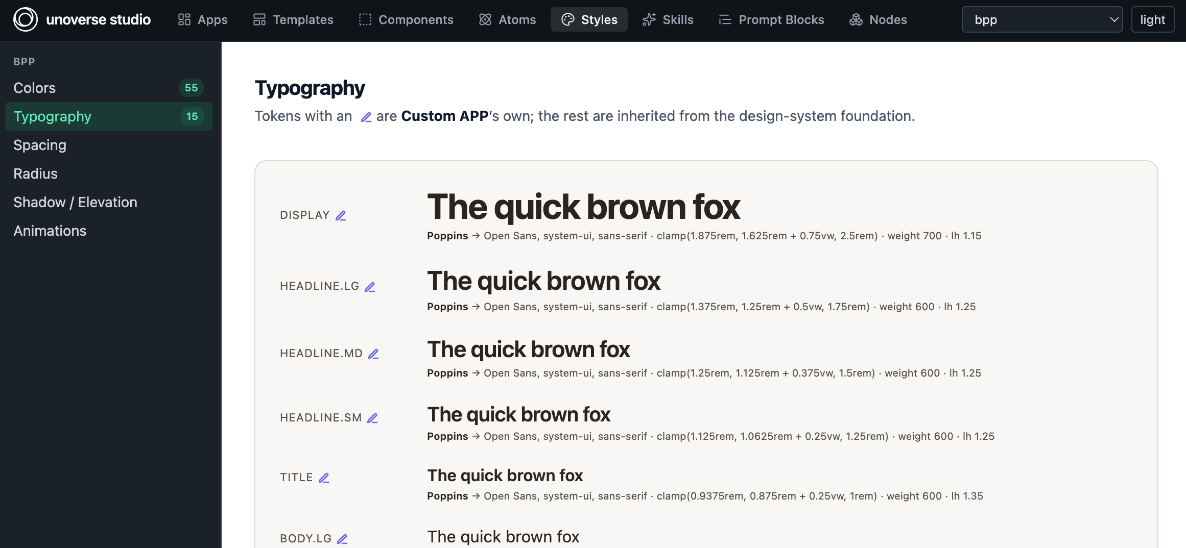
Typography in studio: each role as a live specimen. A pencil marks an override; the rest is inherited.
styles/base/typography.yaml. There
are four, and most rebrands touch exactly one:
To load a webfont, list its stylesheet in
styles/semantic/fonts.yaml. The SDK injects
one <link> per URL, so declaring the family and loading the file are two halves of one
edit:
styles/semantic/text-styles.yaml. A definition writes a role, and the role composes
family, size, weight, line-height and letter-spacing from the base scale, so retuning the
role retunes every use of it:
font: <role> is the
whole typographic vocabulary a definition has. The generic size and lineHeight keys
keep the flat xs to 5xl scale for the rare case that is not a role.
Next steps
Lifecycle hooks
A component that fetches its own data.
Scales
Every space step, page width and app size, with what it resolves to.