

Server-driven UI
The interface travels as data
UI is data, not code. Your universe sends the definition. An SDK on the other side draws it
with that device’s own native controls.One definition serves every channel: your website, your iOS and Android apps, ChatGPT, Claude. Publish a change and it is live on every one of them, with no rebuild or release cycle.
How it works here · MCP Apps · SDUI
Build it
1
Open studio
Open studio:Then open Components. Every definition renders from its prop defaults, and the controls
walk its layouts and states.Open the code view on any of them: the definition on one side, the live preview on the other.
Edit the definition and the preview follows as you save.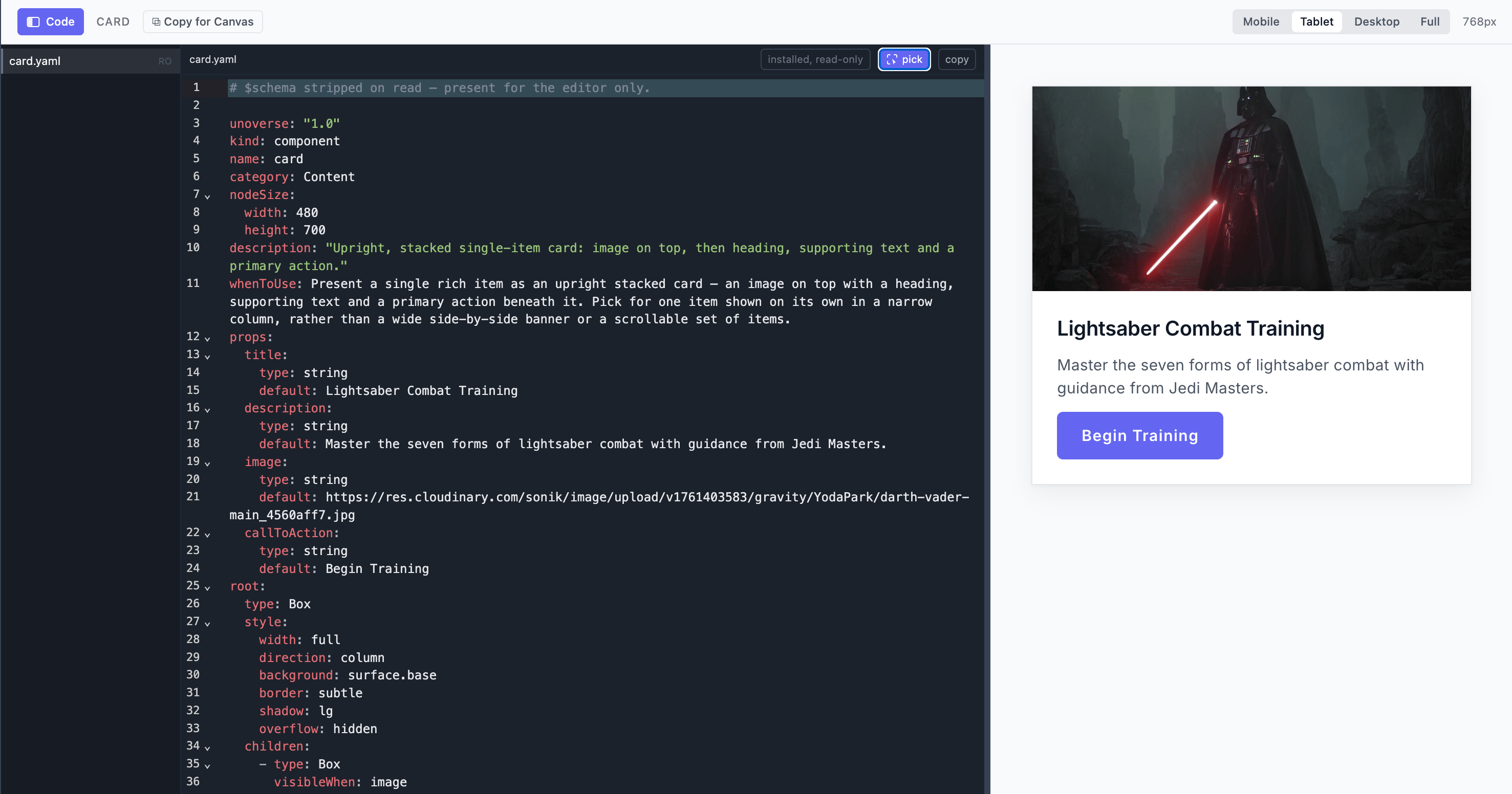
2
Create your org
Your own work lives in your org: its components, its apps, its brand. One org is one Git
repo. Choose Studio, and studio opens on the new repo. A second org is a second repo,
made the same way in a new folder.The folder is now your org’s repo, and the org’s folders sit at its root:That is the baseline: your starting tokens and your four identity documents. Add the other
folders as you need them:
unoverse create asks for the org’s name, suggesting the folder’s, and that name
travels with everything the org publishes.Terminal
components/, apps/, skills/, blocks/, nodes/. The
org’s name comes from unoverse.yaml, never from the folder, so the folder may be called
anything.Worked examples live in one public demo org repo,
acme: a welcome component, a chat app,
a skill, a block and two nodes. Read them and copy what you need.3
Make your theme
The first design work in a new org is the brand. It lives in
styles/:Start with
base/color.yaml and base/typography.yaml: your palette and your fonts. In studio, switch to your org and change a value. Every component re-renders in your brand, live, with no build step. Edit the file, and the preview follows as you save.Change token values freely; keep every token name, and the theme contract stays green.4
Create your own component
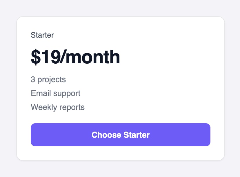
Author your component in your org repo, at Reading it top to bottom:
components/pricecard/pricecard.yaml. The file name is the component’s name, and the lint enforces it. Here is a complete simple price card, and what it renders:- Definition
- Rendered
- Data
components/pricecard/pricecard.yaml
5
Check it
Check it from anywhere in your org repo:The same check runs when you ship, and blocks on any error, so nothing broken reaches a
universe.The linter enforces the design rules with doc-cited messages: token names only (no raw px or hex), every bound field declared in
props, one home for every piece of state. studio and the platform apply the same rules, so a clean lint means it ships.6
Put it in a workflow
One
Component node serves every component you write, so there is nothing to register and
nothing to restart. A new definition is renderable the moment you save it.Your component travels from studio to canvas by copy and paste:- In studio, open PriceCard under Components.
-
Click Copy for Canvas. The component is copied to your clipboard as a canvas node.
- In canvas, open your workflow and paste with Cmd+V. The node lands on the canvas, sized to the card.
-
Double-click it and fill its fields, the same
title,price, andfeaturesyou saw in the Data tab, from upstream signals or literals.
Nothing restarts. Push the component to your org repo, and every universe connected to it
pulls the change: within seconds by webhook, within five minutes by polling. Environments
covers connecting a universe to the repo.
How far this goes
A price card is the small end. A component can carry states and layouts of its own: a wizard that walks through steps, a card that expands to full screen, a product finder with its own private flow. Apps go further. They are whole microapps, with their own layouts and states, discovered and opened by Agents in the conversation. State is handled for you. Each component owns its own, and the platform keeps one shared state for the whole conversation. Views, panels and flows stay in sync, with no state library to wire. The Design section covers all of it: components, state, apps and tokens.Have Claude Code build it

Installed by unoverse update
unoverse-create
The same skill that builds nodes designs components. Open your org repo and describe what you want:Create a pricing card component with a title, three feature lines, and a call to action.It follows the rules this page just walked through: the closed primitives, token names only, a realistic default on every prop. What it writes passes the same lint your own work does.
How the skills work.
Next steps
The Design journey
Components, state, apps, and tokens, in full depth.
Create a client app
Put your Agent on your own website.